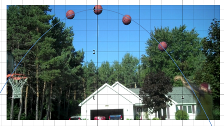
To make a graph I used a quadratic formula to fit the arc of the graph, I predict that he made the shot because the graphs shows it going through the hoop.
|
To make a graph I used a quadratic formula to fit the arc of the graph, I predict that he made the shot because the graphs shows it going through the hoop.
0 Comments
My predictions were not very close to the actual graph. They were different because i didn't put much effort into making the prediction as accurate as possible. My prediction was shaped that way because I thought that the longer it went the farther it would go. The zeros of my graph represent the starting point. All of the graphs have the same zero and minimum. The first graph had the highest maximum, the next graph had the second highest, and the third graph had the lowest maximum. When the graphs are increasing at a fast rate the slope is higher, and when the slope is decreasing quickly the slope is lower. 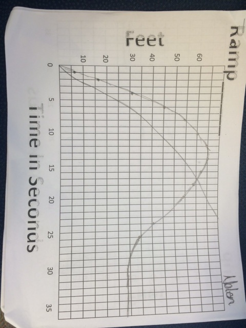 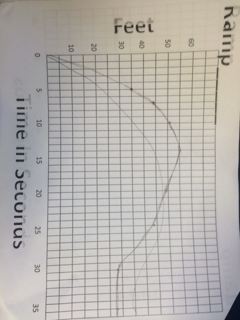 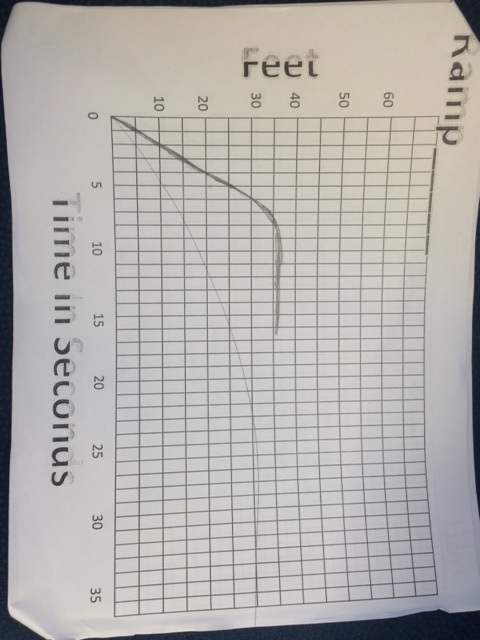 Graph A is an example of a constant rate incline.This graph doesn't show the situation realistically because the graph shows that the flag keeps going up, it doesn't show any kind of plateau. Graph B is an example of when the flag raises faster than the time is going by. Graph C shows the boy raises the flag fast then slows down, but then starts again and then took another break. Graph D shows that he gradually took the flag up, because the rate of increase was gradual. This is the most realistic. Graph E shows the boy hoisting the flag at a very fast rate, then slowing down, then picking up again. Graph F shows that he raised the flag all at once without time passing, this is the most unrealistic of all the graphs. 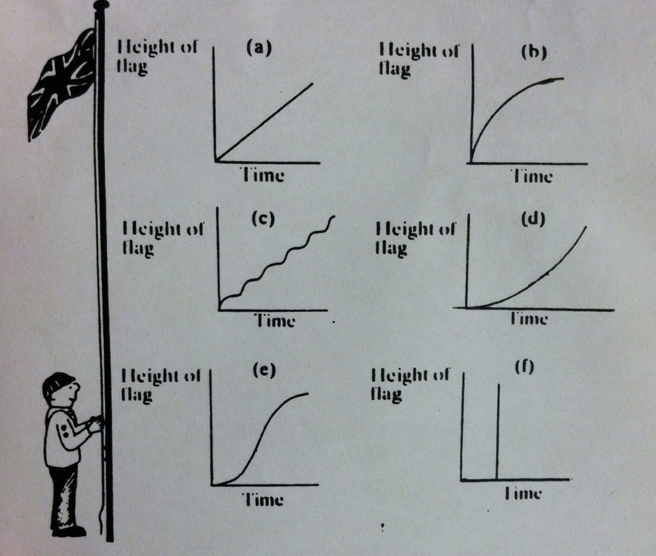 For this assignment we were given a smiley face on an online graphing calculator, and we had to use formulas to add lines and shapes to add features to the face. 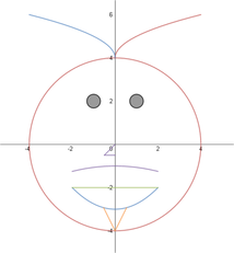 |
AuthorWrite something about yourself. No need to be fancy, just an overview. Archives
January 2016
Categories |
 RSS Feed
